
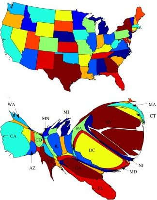
Researchers extracted the dateline
from about 72,000 wire-service news stories from 1994 to 1998 and modified a standard map of the Lower 48 US states (above) to show the size of the states in proportion to the frequency of their appearance in those datelines (below). Some notable results:Posted by Vanderleun at April 21, 2008 8:17 AM | TrackBack* Washington DC accounts for a huge proportion of the news stories - not surprising, since it is the nation's capital, and the home of Congress, the Presidency and other political news generating institutions. But still: DC (pop. 600,000; metro area 5.8 million) generates more news than the most populous state, California (pop. 36.5 million).
I see an inversely-proportionate relationship between the size of a given state on that map, and how "bitter" and "clingy" Obama would think that state is.
Posted by: Morgan K Freeberg at April 22, 2008 6:16 AM"It is impossible to speak in such a way that you cannot be misunderstood." -- Karl Popper N.B.: Comments are moderated to combat spam and may not appear immediately. Comments that exceed the obscenity or stupidity limits will be either edited or expunged.