James Lileks has a new site design and I’m afraid it is time, once again, for a Goudy Old Style intervention.
One of the problems with fontaholics is that, like bears, “once they get hooked on garbage, there’s no cure.”
Regular readers will know that I believe Lileks is one of the precious living treasures of the Net -- except for his, well, “fonting problem.” He as much as confesses to it with:
When you have thousands of fonts, and each speaks to you in a particular way, it’s hard to choose. To make it worse, no matter what font I choose, I have the most boring characters to work with: L and I.The shameful elements are all contained in that brief cry for help: the "thousands" to choose from each ‘speaking to you;’ the view of the self as a bunch of “boring characters;” the association with people of low degree such as ether abusers; the desire to escape into the nimbus of nostalgia in “a 1950s LA coffee shop;” the rejection of basic and decent Pottery Barn and Hello Kitty family values (previously his trademark); and the desire to abuse his own special highly toxic font in solitude.
I chose Gleeburger, a freeware font designed by someone named “Etherbrian.” His home page 404s, alas. It’s a font taken from a 1950s LA coffee shop. Much different from the old retro script font I was using -- which was League Night, by House -- but it’s about time I retired that one. It shows up everywhere. Pottery Barn Kids used it for Christmas. It’s on a Hello Kitty valentine Gnat got. I think I’m alone my gleeburgery for a while. -- Confession signed: LILEKS (James) The Bleat
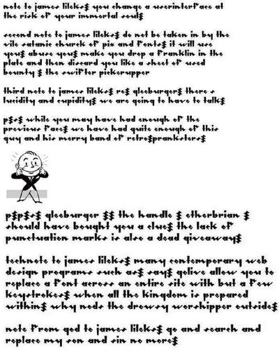
I’m here to help. It is my hope that if people would download the following note to Lileks and send it to him at all known email boxes, he will, at the least, admit he has a problem with fontahol. That’s the first step. Let’s help Lileks take it.