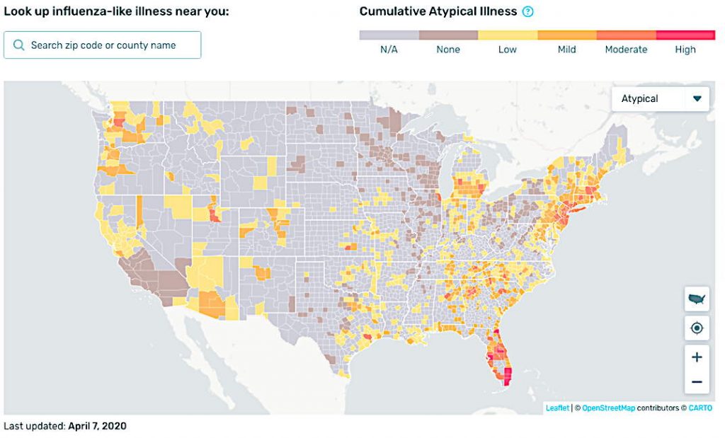
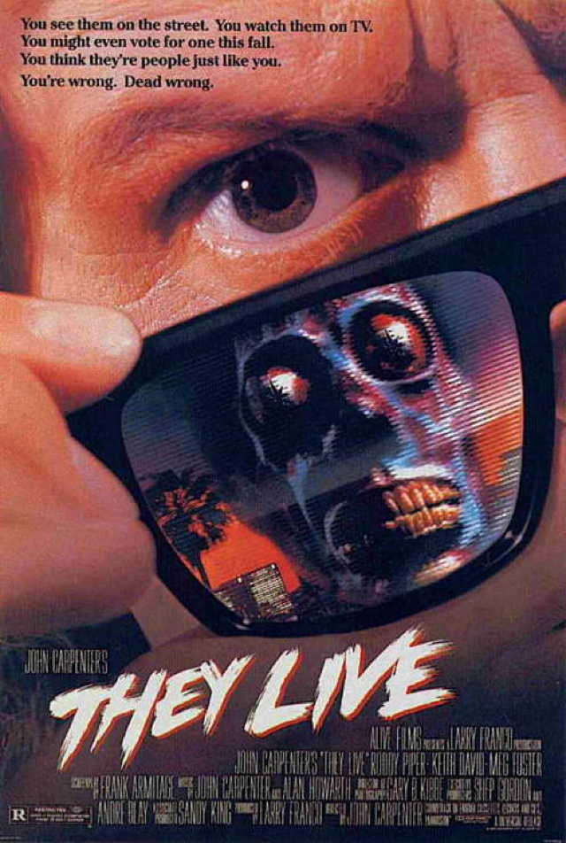
How to read these charts: The map above shows you how much influenza-like illness above the normal expected levels we have detected since March 1.
The time series chart allows you to compare Kinsa’s observations of the influenza-like illness level in the U.S., in orange and red, against where we’d expect them to be, in blue, and see how that relationship has changed over the past few weeks
Overview and Methods The U.S. Health Weather Map is a visualization of seasonal illness linked to fever – specifically influenza-like illness. The aggregate, anonymized data visualized here is a product of Kinsa’s network of Smart Thermometers and accompanying mobile applications, and Kinsa is providing this map and associated charts as a public service.
Tried entering my zip code, 99705, but, alas the map doesn’t cover North Pole Alaska.
None the less, looking out my windows, I can be assured there is not one winnie the flu or any other influenza-like victim or carrier within a quarter mile of me.
Gordon ScottApril 8, 2020, 5:46 PM
Yeah, this site is very, very interesting. There are a ton of numbers out there, and most of them do not compare well to others. Different states, different counties within states, different countries…all of them are reporting numbers differently.
But this one is just one measurement, reported the same way everywhere in the US. It’s basic, but it’s also very informative. What it reveals to me is that among folks who own $65 digital thermometers and who agree to take their temperature every day, social distancing seems to work very well.
Real World Address for Donations, Mash Notes and Hate Mail
Gerard Van der Leun
1692 MANGROVE AVE
APT 379
Chico, Ca 95926
Green Pants Interior by Klahn
Who Am I? by Carl Sandburg
My head knocks against the stars.
My feet are on the hilltops.
My finger-tips are in the valleys and shores of universal life.
Down in the sounding foam of primal things I reach my hands and play with pebbles of destiny.
I have been to hell and back many times.
I know all about heaven, for I have talked with God.
I dabble in the blood and guts of the terrible.
I know the passionate seizure of beauty
And the marvelous rebellion of man at all signs reading “Keep Off.”
My name is Truth and I am the most elusive captive in the universe.
Duty, Beauty, Liberty, Country, Honor, Family, Faith — Plus a few simple easy to follow rules for guys
Men saw the stars at the edge of the sea
They thought great thoughts about liberty
Poets wrote down words that did fit
Writers wrote books
Thinkers thought about it
Take it where you find it
Can’t leave it alone
You will find a purpose
To carry it on
Mainly when you find it
Your heart will be strong
About it
Many’s the road I have walked upon
Many’s the hour between dusk and dawn
Many’s the time
Many’s the mile
I see it all now
Through the eyes of a child
Take it where you find it
Can’t leave it alone
You will find a purpose
To carry it on
Mainly when you find it
Your heart will be strong
About it
[Chorus]
Lost dreams and found dreams
In America
In America
In America
Lost dreams and found dreams
In America
In America
In America
And close your eyes
Leave it all for a while
Leave the world
And your worries behind
You will build on whatever is real
And wake up each day
To a new waking dream
Take it where you find it
Can’t leave it alone
You will find a purpose
To carry it on
Mainly when you find it
Your heart will be strong
About it
[Chorus]
Change, change come over
Change come over
Talkin’ about a change
Change, change
Change come over, now
Change, change, change come over
I’m gonna walk down the street
Until I see
My shining light
I’m gonna walk down the street
Until I see
My shining light
I’m gonna walk down the street
Until I see
My shining light
I’m gonna walk down the street
Until I see
My shining light
I see my light
See my light
See my shining light
I see my light
See my light
See my shining light

 PLUS Christianity Yesterday, Today, and Tomorrow: A Discussion")


 Gerard Van der Leun


Comments on this entry are closed.
Tried entering my zip code, 99705, but, alas the map doesn’t cover North Pole Alaska.
None the less, looking out my windows, I can be assured there is not one winnie the flu or any other influenza-like victim or carrier within a quarter mile of me.
Yeah, this site is very, very interesting. There are a ton of numbers out there, and most of them do not compare well to others. Different states, different counties within states, different countries…all of them are reporting numbers differently.
But this one is just one measurement, reported the same way everywhere in the US. It’s basic, but it’s also very informative. What it reveals to me is that among folks who own $65 digital thermometers and who agree to take their temperature every day, social distancing seems to work very well.